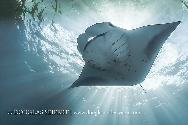
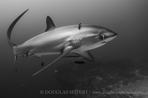
What makes for a great black and white image?

Thoughts On The Blue and The Gray
and a bit of history too…
by Douglas Seifert.
In (underwater) photography and cinematography, the first images were black and white because the first film stock rendered a black and white negative. The pliable, celluloid film stock itself was a remarkable improvement over the glass plates previously required for single exposure images; instead of one complicated exposure, multiple images could be achieved with a camera. Black and white imagery was “natural” solely because it was the only way the world could be represented with the then-wondrous technology.
The first known underwater color images / published images were made in 1926 by Charles Martin, for National Geographic, and were not captured “on film”. The images were created in shallow water, using a housed camera capable of making a single exposure at a time utilizing the Autochrome process: a glass plate with and a collage of random red, green, blue dyed potato starch granules to act as a filter through which light passed onto a black and white silver bromide emulsion. He lit the underwater subject with the flash of explosive magnesium powder ignited at the surface to restore the color filtered out by the physical properties of light passing through water. Thus the first color underwater images came to be and it was that introduction of artificial light that showed the world that the underwater world was much, much more than just shades of blue.
Other than using artificial lights or filters to bring out inherent colors to underwater subjects, there is another method for creating images that go beyond those many shades of blue. The technique is to embrace the monochrome palette and convert the image to grayscale, or what is popularly called black and white.
When done well, black and white can be an art form that has, for subjective and intangible reasons, inherent qualities that appeal more so than the same image reproduced as a well-exposed color image. When done well.
In my opinion, the finest practitioner of underwater black and white imagery is Ernest H. Brooks II. His use of the multitudinous tones between absolute black and pure white is masterful and defines the possibilities, the extremes, and the richness of the medium. The majority of his works are done with ambient light, no fill flash, where the photographer’s hard-won knowledge of where light and shadow will need to be addressed in the darkroom truly come into play, long before the shutter is triggered. But equally essential is the strength of the composition, the choice of subject matter, decisions made in shutter speed and depth of field, and, as always, the Decisive Moment.
Another underwater image maker who excels at black and white is David Doubilet. His emphasis on strongly directed light, in the form of natural sunlight or the megawattage of high intensity lights has created distinctive, awe-evoking images of shipwrecks and manta rays in a night sea that have become classics.
These are two artists who understand the medium and execute their presentation to the highest standard. As is the case with all arts, successful works can inspire others or lead to imitation.
Again, when it works, black and white can be lovely. When it doesn’t…
And this is where one tends to see a lot of bad images rendered in black and white, often with a grain introduced, in some desperate hope that the image will be considered “art” instead of a mediocre, badly exposed, or just uninteresting image. It begs the question of “is bad art art?” and the answer is “how much time do you have to waste?”
Time after time, bad art is foist upon us, most frequently now through postings to social media. Fortunately, it can disappear in the blink of an eye, a click of a mouse. But I digress…
I think the images that work best in black and white are those that would work well in color as well.
Whether an image is better in black and white than the color is largely a matter of personal taste.

I have not personally done much experimentation in black and white for a variety of reasons, paramount being my focus is to render and reproduce the underwater world in all the glory that passes before my eyes and my lenses and I simply do not see things in black and white. I do see light and luminance, however, and year ago learned to use a light meter, so much of my own photography utilizes the same disciplines as required for grayscale renditions, although my intended result is color – natural, not oversaturated – color.
Having said that, when my old friend (and former soldier in the trenches at DIVE Magazine) Charles Hood invited me to take up the black and white Challenge on FaceBook, I decided to just see how some processed (color) images would work rendered in grayscale.
I have to admit that they are different look and some are more interesting to me than others. Only the viewer can decide whether the grayscale or color versions are to their liking or not. As for the compositions, framing, fill lighting (when used), that is wholly my own style and either you like it or you don’t.
As expected, images that have a very strong directed natural light seemed to work best. I didn’t process any soft coral images because I spent so much time getting the lighting right to deliver those colors to begin with, I wouldn’t want to think about shades of gray where the contrasts between vivid magentas and pinks with a blue sea are what drew me to the subject in the first place.
It was a fun experiment, mercifully short in duration and the feedback has been terrific. I can only wonder how the black and white Challenge began but it does seem to have taken on a life of its own. I have seen some truly beautiful images done by people I know and many by people I don’t. I have also seen some, well, embarrassments to whose creators I would encourage to work differently, work harder, try again. It should always be fun and there is no need to discourage anyone. None of us are so perfect that we are not learning every day.
Page 1: Aaron Wong, Daniel Botelho, Stephen Frink, Tony Wu.
Page 2: Alex Mustard.
Page 3: Abi Mullens, David Barrio, Martin Edge, Ellen Cuylaerts, Kurt Amsler, Jason Bradley.
Page 4: Douglas Seifert.
Page 5: Jean Bruneau, Amanda Cotton, Christian Vizl, Brian Skerry, Mike Veitch.